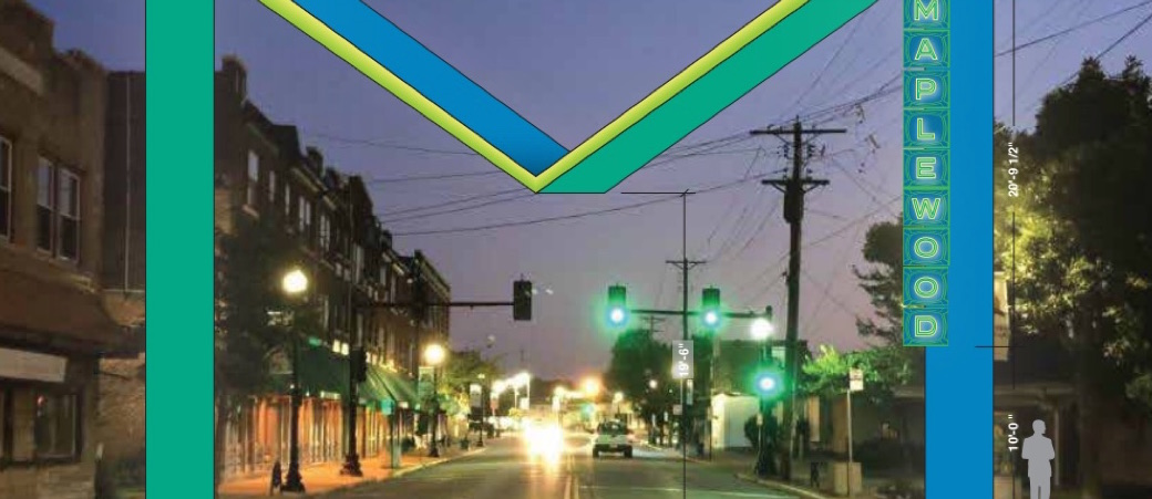
Maplewood commercial property owner Rob Birenbaum would like to see ‘The Big M’ spanning Manchester Road in the 7100 block. He, Bill Berthold, president of Frontenac Engineering, and Heather Testa of Ten 8 Group presented the plan at the Maplewood City Council meeting Tuesday.
Birenbaum said he represented a group of stakeholders who believe the giant M could become a “reference point and an iconic image for the City of Maplewood”.
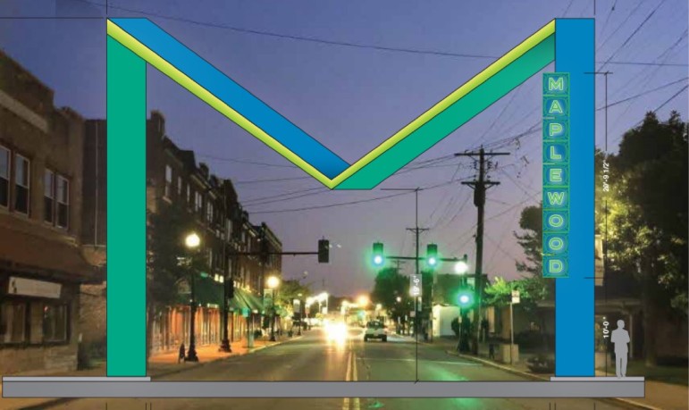
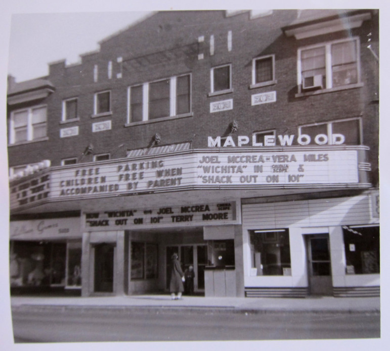
The colors would painted onto enameled steel, reflecting colors of the time period — the colors of neon. The letters spelling out MAPLEWOOD would be the letters from the 1926 Maplewood Theatre marquee, saved for a project that didn’t pan out, stored by the city for several years. The Maplewood Theatre was in operation from the 1920s to the 1970s.
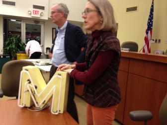
Testa said ‘The Big M’ is a “contemporary nod” to roadside attractions on the original Route 66, such as a giant whale and a giant doughnut.
Council member David Cerven asked why they weren’t shown several designs to chose from, or given a chance for input. Council member Barry Greenberg said design by committee is “one of the most painful things that you can do.”
Berthold said they think it’s important to do something to identify the city and have a positive impact, especially on the east end of Manchester. He said the idea came from the Maplewood Chamber of Commerce Economic Development Committee.
Berthold said they estimate the cost will be $320,000. He said they believe they can raise more than half of that through private donations; that they have a list of about 75 people who will contribute between $150,000 to $175,000. They would like the city to commit to the rest.
Mayor Jim White said he would first like the group to get the donations then come to the city with a firm amount for the rest. Berthed said it would be better for donations if they could tell potential donors that the city has already committed to the project.
The Maplewood officials made no commitment to the project.
Doug, why couldn’t we get something cheaper for Maplewood, like the Corinthian Column newly erected at one of the western entrances to The Hill? Specifically, located on the southeast corner of Hampton and Columbia Avenues.
No to the M!
More than a quarter of a million dollars?!
Don’t we have other pressing needs?!
Second.
dial “M” for Misappropriation.
Seriously? Have you seen the condition of our streets? I’ve traveled extensively in the 3rd world and rarely see streets there that are as bad as some of ours. Come on, folks.
Secondly, what qualifications did we vote on for our council members that gave them special insights into art? They were the ones that were going to tear down the bus loop pavilion! Much better to have a design competition by people who actually know what they are doing and then have the citizen’s weigh in on various options like we did the bus loop park. Politicians may understand artful phrases and greasy deals, but stay out of real art, please.
Q!
Q! – The city council only heard the proposal and had a few questions. They may or may not respond.
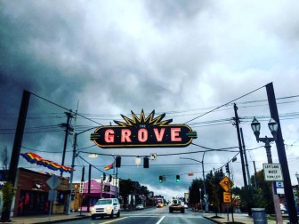
Let’s start with the fact that the design is hideous and is not architecturally appropriate for the neighborhood. This “M” design belongs in Miami, not in a neighborhood with mostly early 20th-century brick construction. Let’s also talk about how every time I drive through the Grove, at least one light bulb on that sign is out, sometimes entire letters. Let’s also talk about how the Grove sign is paid for with donations, not taxpayer funds. Who is on the hook for this thing once it’s installed? And what about our pock-marked streets? We are building a massive addition to the ECC, yet the streets to get to that school are some of the worst in town. Maplewood needs to finish fixing it’s vital infrastructure before it spends $300k on a neon albatross.
Funny how these developers, deal makers, and council persons from the city of maplewood see this as a great attraction to Maplewood.
How about addressing these jagged, patchwork concrete streets that are on practically EVERY side street in Maplewood? The streets are serious disrepair and cause more wear and tear (and expense) on vehicles of actual tax paying residents of Maplewood!!! ‘Let’s put a giant M across Manchester, it’ll be so GREAT for everyone! We’ll foot 1/3 of the cost, the city will then pay our business partners the other 2/3 of the cost and it’ll be just WONDERFUL!’ Meanwhile the side streets in Maplewood will not be repaved for another 20+ years. Those cobblestone streets St.Louis city are a smoother ride. It’s sickening, really but not surprising. Enjoy your shiny, dull 375k ‘M’. ‘Who cares about the roads, we have an ‘M’, yippie!’ Ridiculous.
The decision to anchor it to the ground and not have it floating above the road is not one that should make much of a difference in the scheme of things. Judging by some of these comments, you would think that cars are careening off the road hitting whatever is in site.
I like the idea of having something that is different and distinct. For reference, San Diego does an amazing job of ensuring their neighborhood signs are different and represent the neighborhood and culture:
http://www.sandiegouniontribune.com/news/2013/jul/03/neighborhood-signs-san-diego-hillcrest-hp/
I really like the idea of a “gateway” eye-catcher for Maplewood, though I think a suspended sign (of “The Grove” type) makes more sense. Why?
1. Graffiti – (The Grove sign up high isn’t t a ripe target.)
2. Accident damage – (One auto accident could permanently damage a ground piece.)
3. Maintenance – (Painted surfaces need maintenance and can be easily damaged either by hand or by weather.)
Let’s hope to see other designs!
I love the proposed idea of a big M. Maplewood continues to experience an ongoing revitalization.
This town has many great things working in it favor. It’s located in the central corridor of St. Louis with great access to all the highways. It’s minutes away from Clayton and downtown Stl. It’s well served by metro link. It still enjoys a unique and classic neighborhood charm in many ways with good housing stock, parks, and amenities. Forward thinking is enabling Maplewood to attract many unique businesses and restaurants that have added to its re-growth. The west side of town is well positioned to catch all the north/south traffic, where ongoing projects are in the works, such as giant mixed use development on the Sunnen properties.
For all of these reasons Maplewood has attracted many in the arts community, young professionals and families, and has become somewhat of a hot spot for visitors from around town. When I for example moved to Maplewood in 2001, many thought I was crazy and said: “Why?” Now that has changed and I’m proud to say I live here. In fact I work all over St. Louis and many out in Chesterfield and Wildwood are taking note. Some have mentioned visiting here to shop or dine.
If we want to put Maplewood back on the map and continue to be the talk of town we need creative thinking to prevail. The Grove, as many here mention, is trendy in its own way. There are many things to like about it, including their sign spanning Manchester. But we’re not trying to be the Grove are we? Do we want to be a copy cat community, like shallow minded suburbia, or do we want to be a trendsetter, unique in our own way? The Grove sign, while nice, looks like a $60,000 sign compared to the $320,000 sign being proposed for our town. The reason it was mentioned in the Post-Dispatch is because it’s something much more unique., unlike anything else it St. Louis.
I do however like the idea of incorporating a maple leaf into the sign. I do also support the idea of getting community input, but I’m not necessarily opposed to letting ambitious and talented individuals work for the good of the community. This is a forward thinking team that’s invested in this neighborhood with Rob as a business owner. It’s a tough call but too many hands in the pot can often result in watered down thinking and things can stall out.
I agree it’s a lot of money for a sign, but it becomes much reasonable if they can do as they say and raise half or more of the costs from businesses. Projects like this, while costly, bring much interest and money to the community in the long run. Money for street paving and other necessary infrastructure. Everyone is entitled to their opinion but I do strongly feel that this would great for the east entrance to Maplewood and in continuing to help revitalize the business district along Manchester.
I do agree that Maplewood, being a unique neighborhood, should have a sign that reflects as much. However, I don’t think that doing something similar to the Grove sign would be copying, at least in a negative way. San Diego has several that are similar, but each is still unique.
Still, the cost is just too high. For an example, the Gaslamp Quarter sign in San Diego cost 150,000 when installed in 1990. Even with inflation, that is still a good deal less expensive. And that is a great sign.
Hmmm…..a giant, enameled steel, neon colored “M” spanning Manchester Road? I’ve read and reread the story several times, and scanned back and forth among the photos, but I still can’t see how this “M” will enhance either the way our town is presented, or the experience of those coming to visit our many attractions. It doesn’t complement the original architecture along the business district, and I can’t figure out what “time period” in Maplewood it proposes to reflect. That’s using a lot of our taxes to buy something that just doesn’t seem to fit Maplewood’s hometown atmosphere and image.
I know I don’t get a vote, but if I did, the Big M would not get it.
I love your enthusiasm. the kinds of changes Maplewood has been making reminds me alot of the Greenwich area of ny. i pretty much agree with Jill that it seems an idea needing more development . You should have a contest with as many unique shops and out of the way places, have an emblem or signage contest. Let the project be reviewed for cost and maintenance, then let the residents pick. Maplewood is loaded with talent like that.
Gosh that’s ugly! Hope nobody crashes into it like they do the ugly telephone poles.
I agree with many of the comments made already on this board. I’d rather put $300,000 towards improving our roads and sidewalks. I can’t tell you how many times I’ve tripped on an uneven, crumbling, dismayed sidewalk.
I love this city but I have no interest in $150,000 of tax payer money going towards a sign.
I’d like to see a maple leaf on it signifying Maplewood as we’re to seeing from the city. I love the marquee. Not so excited about the M unless it has the official maple leaf on it.
Several knee-jerk reactions from me… And I feel like I have a right to weigh in, because my husband and I live in Maplewood and own a business in Maplewood. We love Maplewood.
$320,000 for a sign is insane! That amount of money for an UGLY sign is criminal. The Grove sign is very well done. How can something as tasteful as that only be $60,000, but this hideous “M” be more than three hundred thousand?
As much as I know my opinion won’t make a difference, I have to say $300K could improve a block or two of the worst streets I’ve ever seen. This won’t win me any points with the city, but the couple of times I’ve called City Hall to ask about street improvements, I’ve been directed to a horribly vague map; a map that really gives no timeline. Number rankings? Yes. A timeline? No, unless updates have been made recently.
Finally, I believe Maplewood’s reputation as a walkable retail & foodie community can stand on its own. I certainly don’t think a giant, ugly M sign will draw people to our fantastic community.
Idea good; object bad.
Agreed
Going to have to vote NO on this one as a Maplewood resident and business owner.
This is ridiculous. There ate too many other things to spend money on. The Grove sign is very cool. This one is not.
It would be nice to have everything we want; but at this time, this large amount of money could be better spent on individuals and groups in need here in Maplewood.
Wonderful. And all we would need to complete the carnival effect is a barker, a Breaded Lady and Jo Jo, The Dog Faced Boy.
another ridiculous idea to spend tax payers money. once again, we forget about the roads in distress. how about turning the large number of “green spaces” maplewood owns (empty lots) into parks. who is going to pay for the upkeep? the cost to light the sign? and I bet the work won’t go out to bid. THIS IS NOT WHERE I WANT MY TAX DOLLARS TO GO.
I am not crazy about the design. I think using the letters from the theater is a great idea, and work them into something like the Grove, as Nick mentioned. Why not add the letters into a newly built sign that looks like the logo? With a smaller leaf stretching just from maybe the “L” and the “W”, this could look really neat across Manchester.
http://maplewood-chamber.com/wp-content/uploads/2012/03/City-of-Maplewood-Logo1-228×300.gif
That plan sounds like a pretty good idea. I really like the Grove’s sign and how it spans the road way right at the entrance. Spanning the street might be the only option at the proposed location since there is not much room to put something off to the side. However, I believe that part of the idea behind this “Big M” plan was to do something very unique and not just be a copy of the “Grove sign.”
I like the idea of a sign as well. I agree with eok that perhaps something similar to the grove would be safer and less likely to suffer damage.
Agreed! And the Grove sign only cost $60,000.
$320,000???? Really? Nothing the City needs more than an “M”?
While I understand the Chamber of Commerce would like to identify Maplewood in a clearer way to the larger St Louis community, I wholeheartedly agree with David Cerven, that the council should be presented with a variety of options to choose from and the community should have a chance for input. My husband and I had to choose new paint colors for our house recently, so I sympathize with Greenberg’s comments that the design process is “one of the most painful things you can do”, and more so for such a large, public and expensive project. Which is why it is important the whole community has an opportunity to present their input.
I would like to see something that creates a theme for the city, perhaps tying in the proposed city hall sign, and the Maplewood sign on the other side of Manchester by the Metro link, or some sort of maple leaf emblem which is present on all the city letterhead and signs. The goal should be a seamless, cohesive brand for our community, not a monstrosity that sticks out like a sore thumb.
Personally, I don’t like the proposed idea. It does not tie with anything else in the community. I do applaud the designers intentions to integrate pieces of the Maplewood’s history, but perhaps there is a more aesthetically pleasing way to do it, with attention to design elements already in place in other parts of the city.
So I sat in the meeting and listened to the presentation and believe Doug did a fair representation in this article. And just like many people already commenting, because its primarily art, the councilmembers had a varying degree of opinions. One of the key points worth commenting on is the contrast of David Cerven’s comments and Barry’s comments. David’s comments were that the council has always done projects in the process of where the council is given a handful of options on color or some other design element and they pick and choose what they like and make the design that way (kind of like how you order a burrito at Qdoba). Barrys comment “that design by committee is one of the most painful things that you can do” was said to mean that having a group of people driving the design plan in that way is far less productive an outcome than defining the problem and letting the architect come up with a plan that meets the goal (he prefers the fine dining experience where the chef preps you a meal of his choosing). I wouldn’t go as far as to say Barry wants a “take it or leave it” type plan, which David was clearly concerned about, rather that he wants the primary designer to be the architect and minimal changes are made. Both supportive of a project on Eastern Manchester, just different ways of completing it.
And strangely I think there is room to agree with both of them. On one hand I agree with Barry because the Veteran’s Memorial that was referenced in the meeting as a project the council was the primary lead on is horrendous design and currently a waste of tax money. At the same time, I agree with David that as a tax payer putting money into this, I want to have some control over the project. So what I hope happens is that a design contest is held. Citizens could then pick from a few set proposed plans. Everybody wins.
—
The funding of this project is another separate discussion. The mayors comments of getting the funding first are his opinion only and not the entirety of the council. It was ambiguous if that was what was going to happen. The project designer had clearly discussed it and preferred to do the reverse where the council set a proposed amount the city would cover and if donations were unable to cover the rest of the expenses (approximately $150,000), then the project would fall through regardless of council’s vote. Part of the supposed reasoning behind the Mayors plan is that the budget for 2016 has not been finalized yet so there are a lot of questions needing to be answered about where the priorities lie and how much money can actually be dedicated before this gets a stamp of approval.
I totally agree with what Adelina said.
It is a sound idea however I can see this possibly being hit by vehicles or even spray painted by vandals.
Possibly a fun sign that does not span the roadway would be better and more cost effective?